


UX, PRODUCT, MOBILE APP
In 2016, Active Hours added a suite of new features to their app called Superpowers, empowering employees to take to take control of their finances in new ways beyond the core “cash out” offering. The three new features, called Lightning Speed, Balance Shield and Buck Booster, were initially integrated into the app in inconsistent ways: tucked away in various secondary menus, it was difficult for users to understand the Superpowers as a cohesive set of features and use them easily. I was brought on to design a more holistic user experience around the Superpowers. My job included performing a UX audit, rethinking the overall architecture of the app (and the relationship between the Superpowers and the core product), and redesigning the navigation experience and homescreen.
Active Hours
UX Designer
UX Audit, User Flows, Sketches, Wireframes
Tino Chow, Project Lead
2016
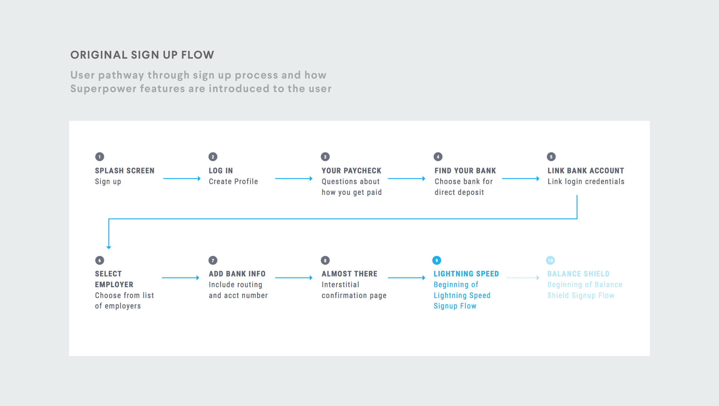
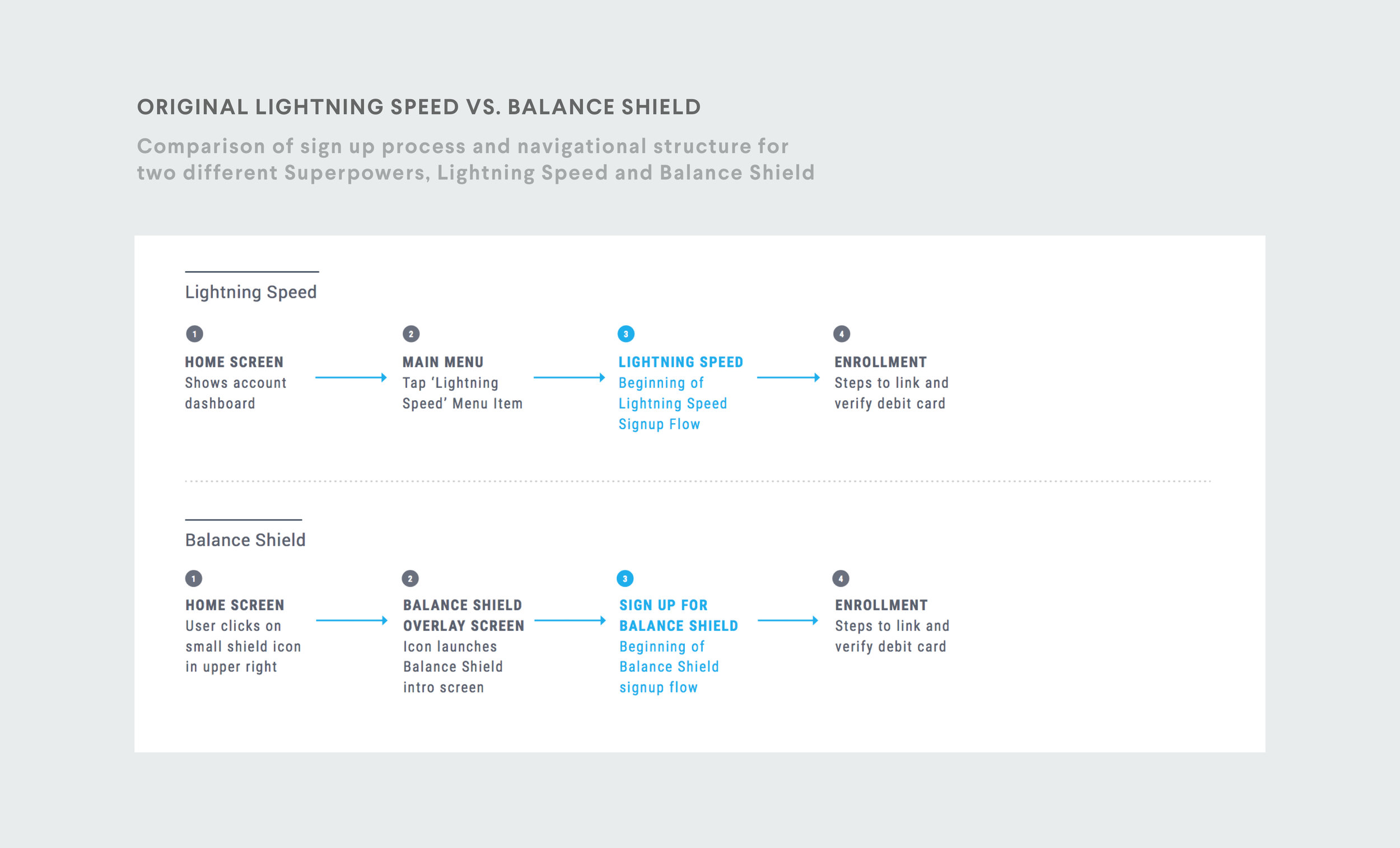
The first step in the design process was performing a full UX audit to understand the structure of the Superpower features and the different access points for users. I created user flows of the app sign up flow, as well as two of the different Superpowers, to understand the inconsistencies and pain points in the process.
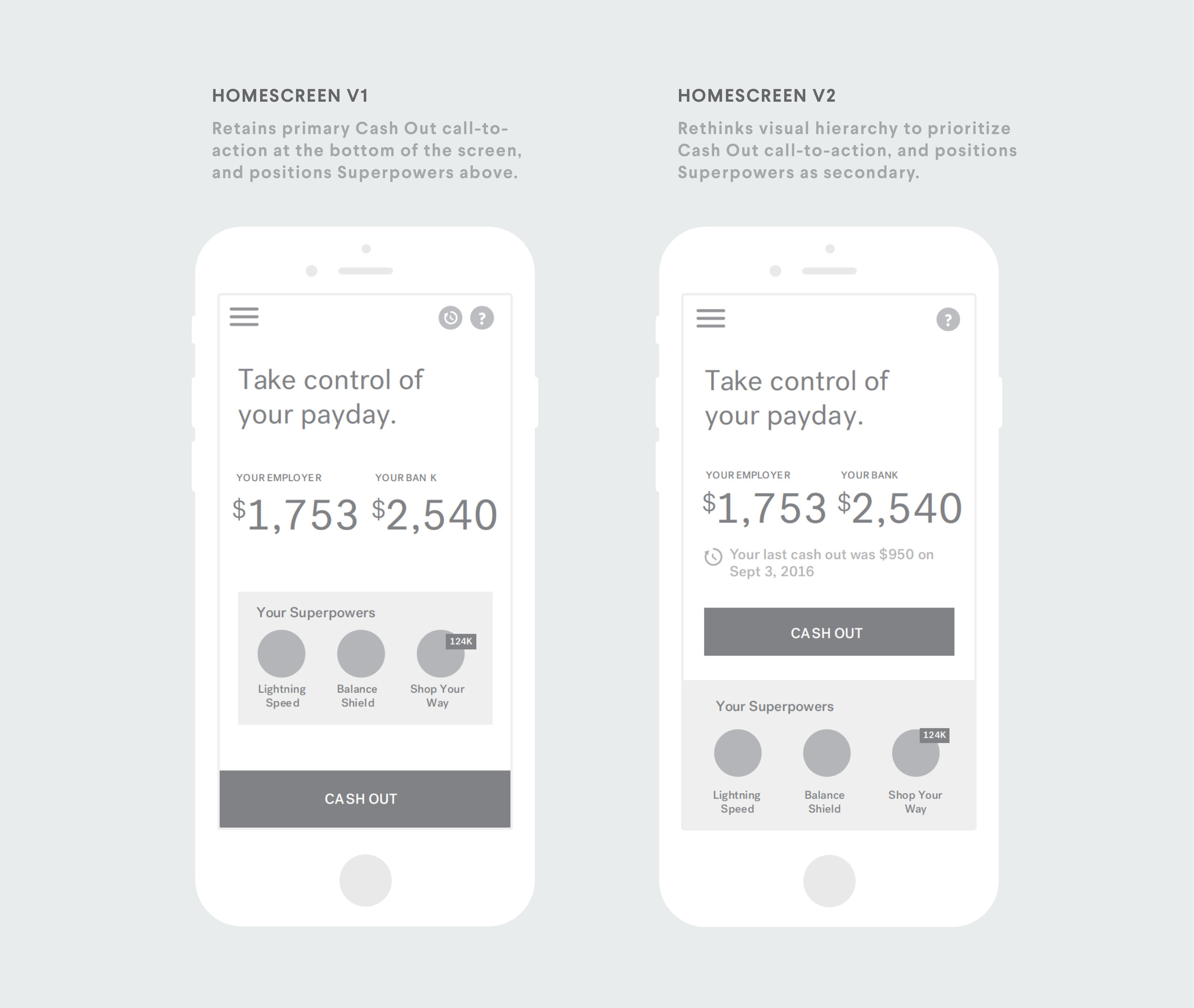
With a better sense of the existing information architecture and flow for the Superpower features, I was able to propose a revised information architecture and navigation flow. My overall guiding principle was to create a greater sense of consistency between the three Superpowers and to also establish a clearer hierarchy within the app Through a series of iterative sketches and accompanying user flows, I proposed two different solutions for the Superpower features:
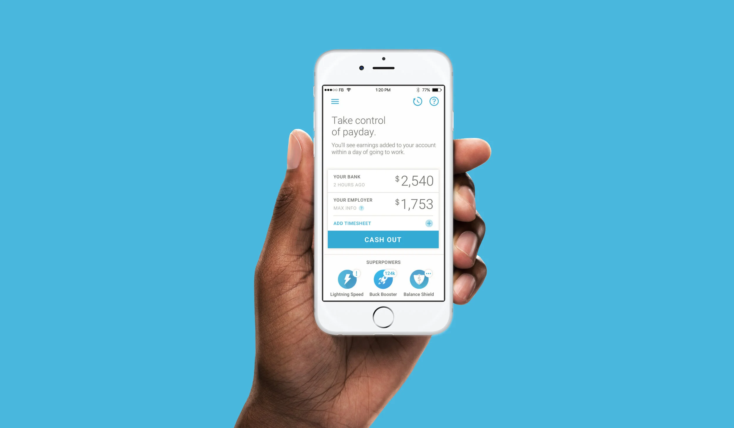
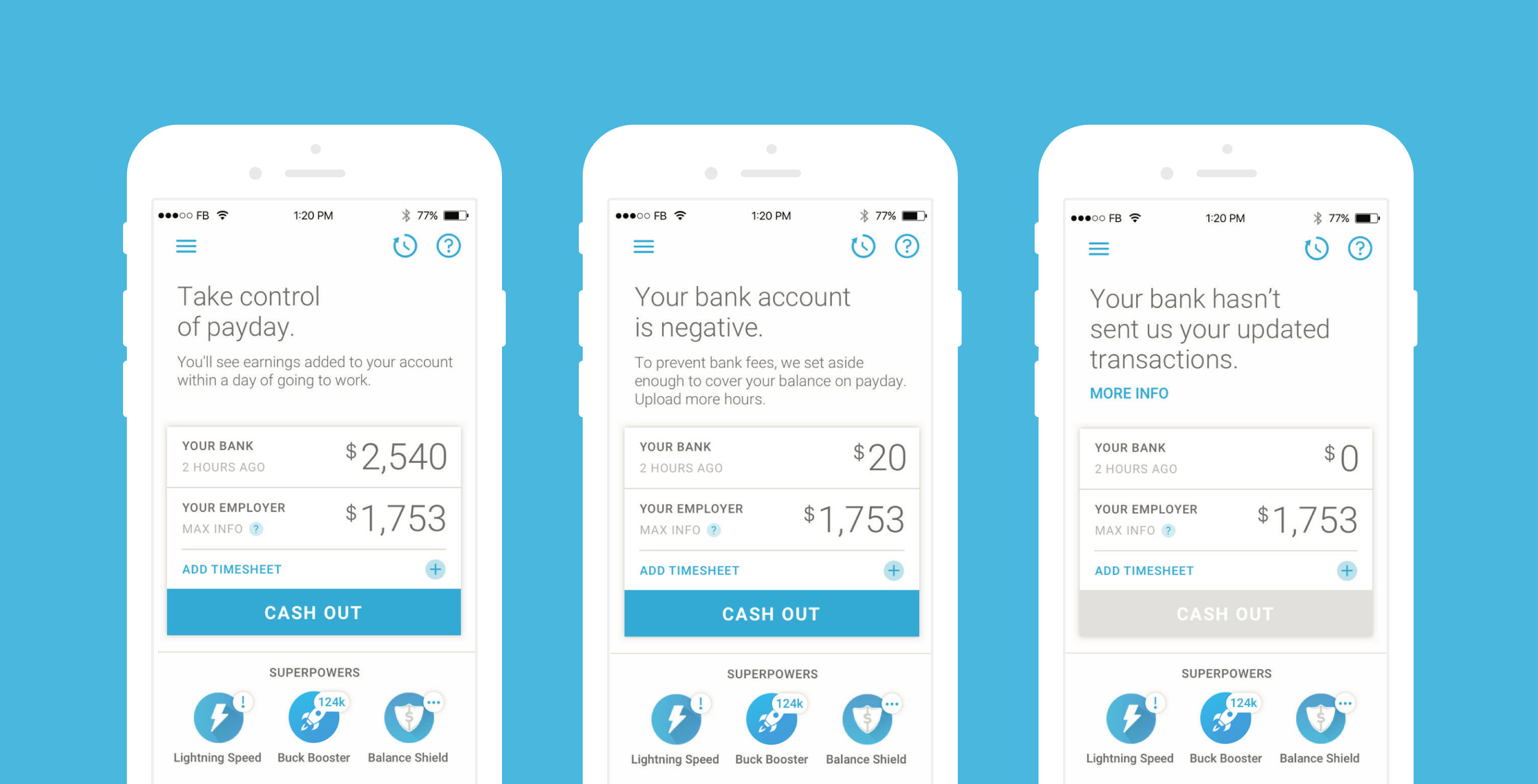
We decided to position the Superpowers on the homescreen, almost like a for users to access them individually, turn them on and off, and visualize any relevant alerts or status associated with each one. We addressed the visual hierarchy of the homescreen and with guidance from the client, we decided to prioritize Cash Out as the main feature call-to-action and make the Superpowers secondary. History and help icons were also placed on the home screen for easy access.
In addition to the redesign of the homescreen, I also designed the user flow and wireframes for the Buck Booster / Shop Your Way sign up flow. Because we were integrated with Sears' Shop Your Way product, I had to follow external specifications for many of the sign up flow design decisions.
The redesigned navigation and homescreen was brought into a final UI design phase and integrated into the Active Hours app in 2016.