
Google Project Ara Biome Module
UX, PRODUCT, MOBILE APP
Google Project Ara Biome Module
A tiny ecosystem of living microorganisms, algae, and tardigrades that users can view through their phone screen

For the launch of their modular Ara phone, Google commissioned Midnight Commercial to create an experimental add-on module that would highlight the capabilities of the new product.
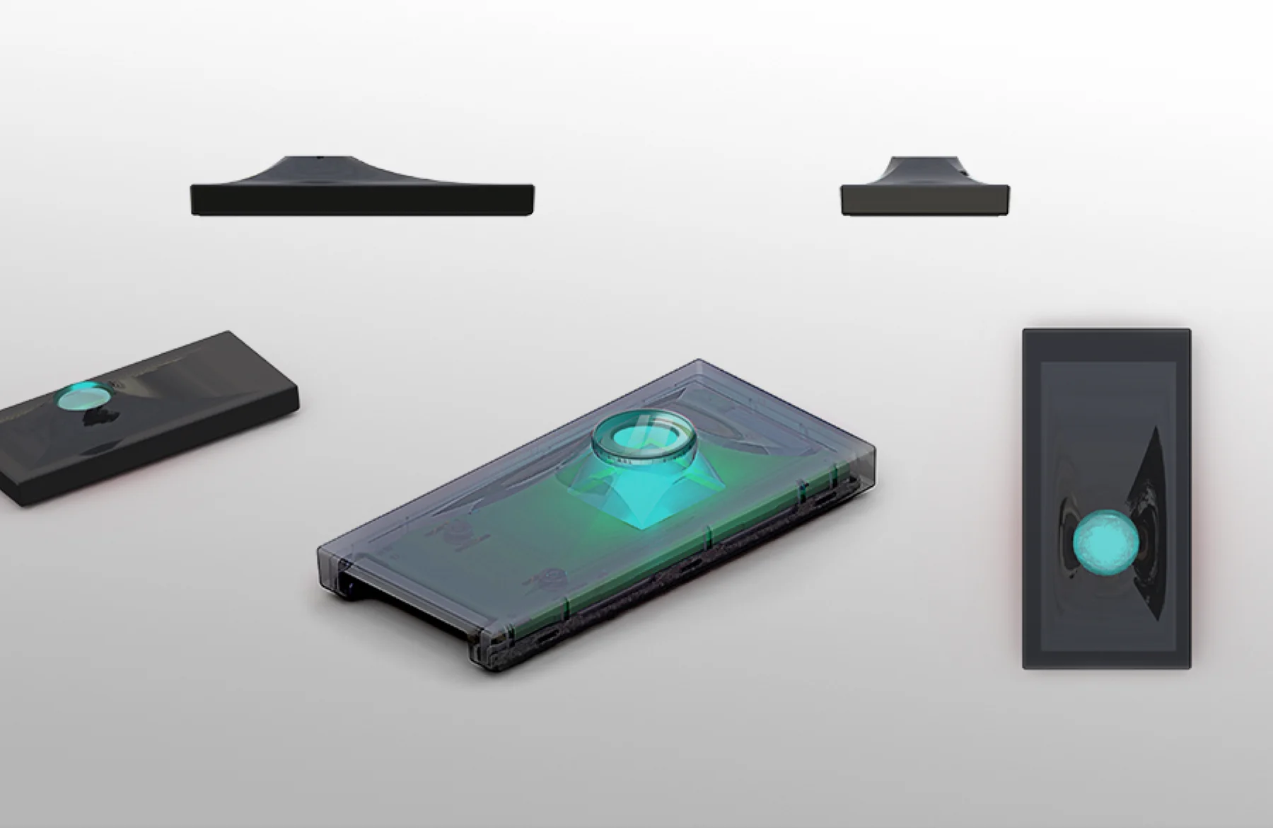
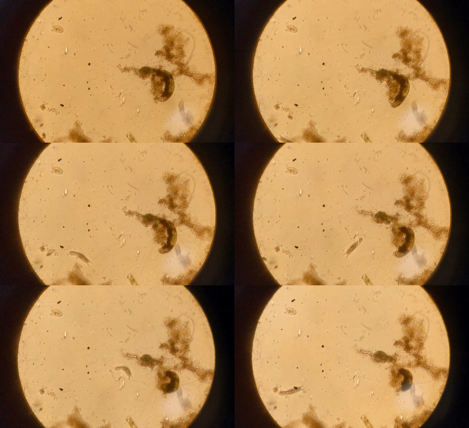
The brief was simple: create the strangest and most groundbreaking module possible. In response, our team created a hardware and software prototype for a new module that was both a technical feat and conceptual provocation. The module itself was a tiny sealed biome of live organisms such as algae, rotifers and tardigrades that snapped into the phone. Outfitted with a custom microscopy system, the tardigrade biome could be viewed, explored and captured through an accompanying Android app. The module prototype is a provocation that asks users to develop a new kind of relationship with their phones, one based on cultivating intimacy and care for the living entities contained within it.
Client
Role
Lead Interaction Designer
DELIVERABLES
Feature Set, Information Architecture, Sketches, Wireframes
TEAM
Noah Feehan, Lead
Viniyata Pany, Designer
YEAR
2016

Project ara TARGET AUDIENCE
Google ATAP’s Project Ara embraced the idea of breaking a smartphone into modular pieces. Using Ara, users would be able to build their own custom phones simply by swapping out and rearranging different “modules” – ranging from batteries to sensors to lenses. Google’s primary goal was to build an open hardware community around the phone, encouraging developers and smaller companies to build their own modules that would work with the phone’s core hardware.
Midnight Commercial’s Ara module, created for the launch of the phone and targeted toward its early adopters, was designed for makers of all kinds, including developers, Silicon Valley gadget-lovers, hobbyists and self-professed DIY aficionados. The primary goal of the module was to fully showcase the technical capabilities of the phone (and thus get people excited about what they could build for it), and to push the limits conceptually while doing so.
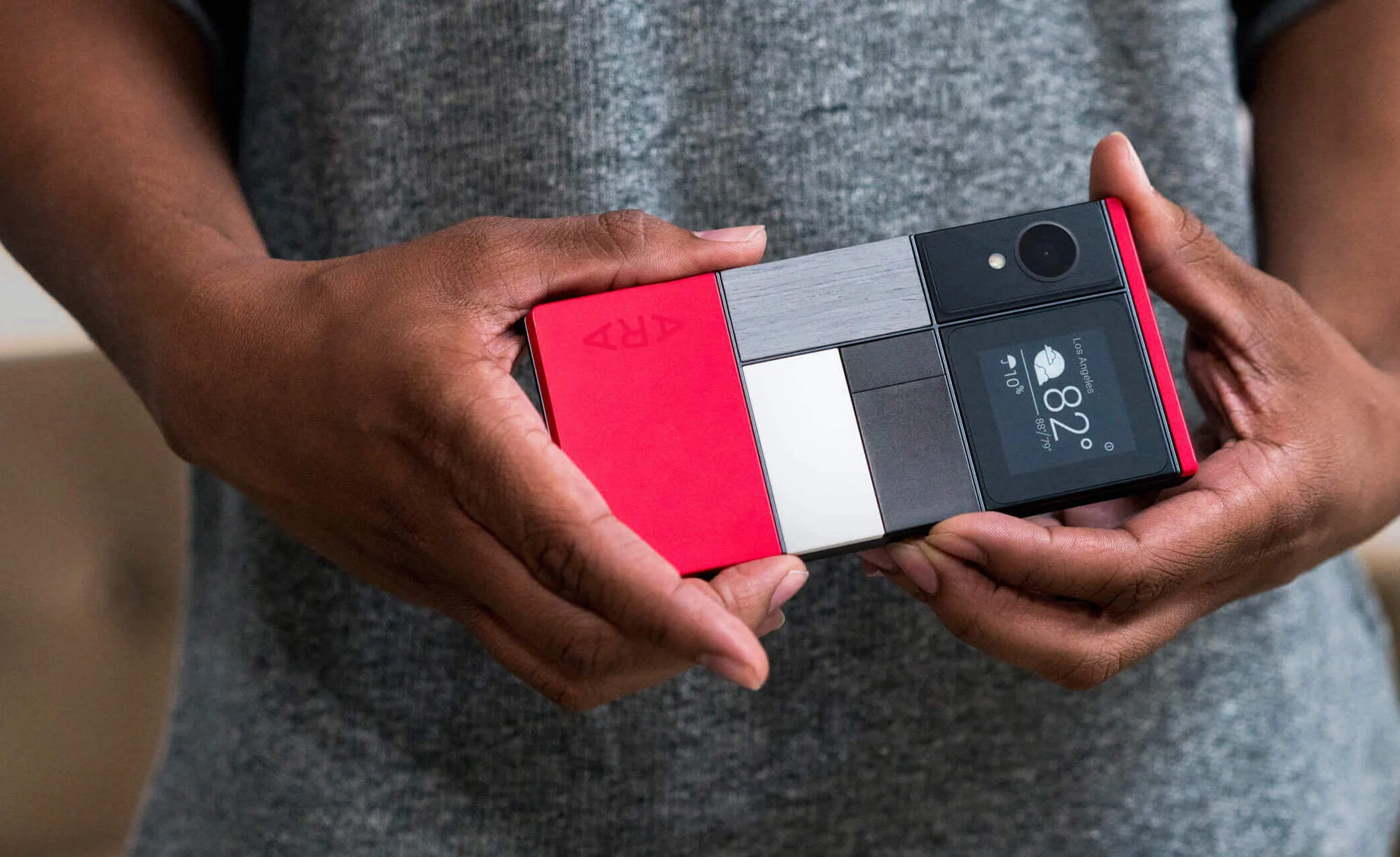
Module Concept: “A Living Tamagotchi inside your phone”
When I began working on the Ara project, the Midnight Commercial team had already settled on the idea of creating a microscopic aquarium inside of the module that could be explored through an app (like a “living Tamagotchi inside your phone.”).
With a loose concept established, I was brought onto the team to lead the interaction design of the app that would accompany the module. My role included developing a core feature set and information architecture, creating low and high fidelity wireframes, and producing interactive prototypes to present to Google. All of these deliverables were developed in parallel to a team of industrial designers and mechanical engineers who were prototyping the hardware and testing the physical feasibility of the module.
FEATURE SET
The design process began the process by developing, and then iterating on, a feature set for the MVP of the app experience. Through various rounds of brainstorming, we developed a wishlist of features that ranged from practical to educational to exploratory.
The interaction design also included working through high level questions around the product feeling and tone. How would that app talk to users? Is it friendly? Funny? Moralizing? Is it educational? These questions influenced high level decisions such as prioritizing features to more granular ones like notification copy.

For the MVP, we decided to focus on a set of core functionality that allowed users to explore and browse a live feed of their biome with as little friction as possible. Users would also be able to capture their biome through snapshots, video and timelapse, as well as a feature to set a persistent Live Wallpaper on their Android phone.
The MVP features were prioritized based on keeping the integrity of the biome and the health of its creatures. Exploratory features such as dressing the tardigrades and changing the background of the biome were deprioritized due to their reliance on computationally intensive computer vision techniques that overheated the module.

INFORMATION ARCHITECTURE
Beginning with the MVP feature set and a stack of sticky notes, we created and iterated on an information architecture of the app. With input from stakeholders, we experimented with the hierarchy of different features and created an information architecture that accommodated different user pathways. We also made sure to established a structure that could accommodate the addition of more experimental features down the line.


SKETCHING AND WIREFRAMING
We began the wireframing process with many rounds of sketches and paper prototypes. We looked to existing capture apps for photo, video and timelapse, and adapted familiar UI patterns and layout structures to this more experimental context.


HIGH FIDELITY WIREFRAMES
We created many iterations of high fidelity wireframes based on the MVP feature set, and used InVision to make clickable prototypes.
Browse Biome: The number one feature of the app was to deliver users a beautiful biome-browsing experience. Beyond the live feed, the app allowed users to adjust the viewing settings of their biome such as brightness and contrast and set a live view of the biome to be the wallpaper of their phone using Android’s Live Wallpaper feature.

Capture Video: Basic photo and video capture was part of the MVP feature set, allowing users to capture and share a view into their biome. Video capture used a unique pre-roll feature.

Capture Timelapse: In the MVP, users could commission an ongoing timelapse recording of the biome even when the app was closed. They could do so on a daily or weekly basis, or at their own custom interval.

Dashboard Concept Sketches: We came up with the concept of the Dashboard as a place for users to see the health of their biome over time. Basic “supervisory” data such as temperature and humidity (collected in the background at least daily) would be visualized and summarized using pithy, fun language. Because the physical module and embedded sensors were being developed in parallel to the app, many specifics were unknown (was the app capable of detecting algae coverage? could CV accurately count the active creatures in the biome?). The Dashboard wireframes presented here are at the proof of concept stage.

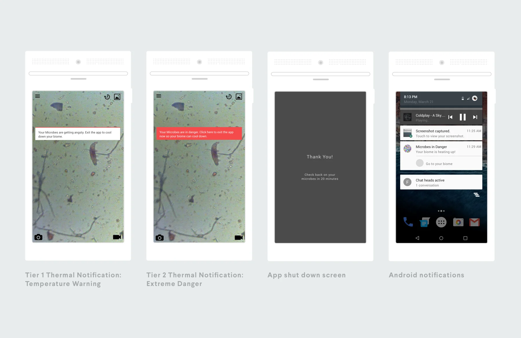
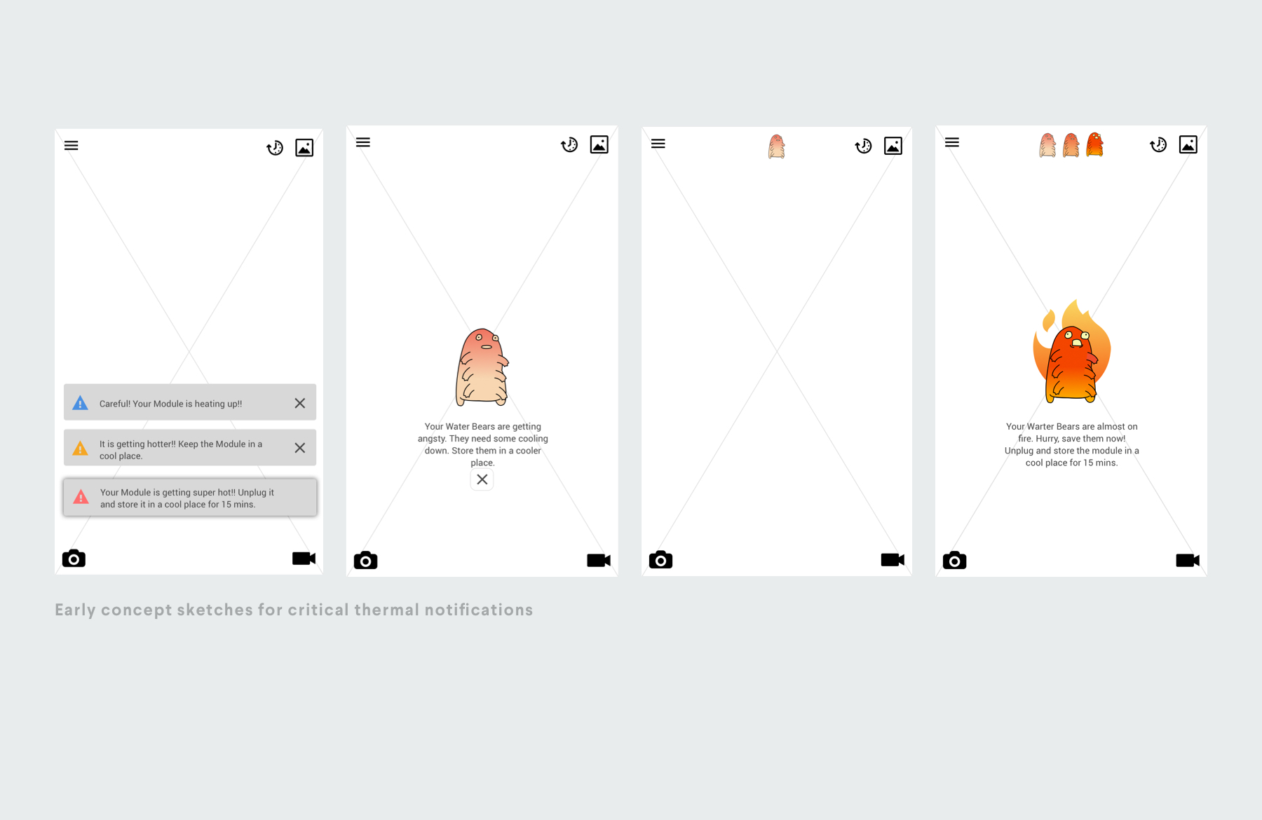
Notifications and Concept Sketches: The notion of living organisms inside a phone presented a new challenge: designing the experience around basic “supervisory” procedures needed to analyze and maintain biome health. The MVP implemented a basic tiered notification system that would alert users to temperature spikes in the biome.
In our sketching phase, we also experimented with fun and gamified approaches to notifying users about the health of their creatures.
PROJECT OUTCOME AND PRESS
In Fall 2016, Google suspended development of Project Ara, and the phone was never brought to market. Though Midnight Commercial’s module development was paused, the project was featured widely online.