AT&T It Can Wait Homepage
UX, WEB, INFORMATION ARCHITECTURE
AT&T It Can Wait Homepage
A content-driven restructure of AT&T’s It Can Wait campaign homepage

AT&T launched It Can Wait in 2010 to raise awareness around the dangers of texting and driving.
By 2013, the campaign had evolved to focus more on taking action, and building key partnerships with schools, communities and corporate advocates. The It Can Wait campaign had two main digital hubs: the primary campaign website (itcanwait.com), and a secondary homepage within the AT&T brand website (att.com/itcanwait). In 2013, AT&T came to Interbrand, their brand agency of record, to rethink the structure and design of the ICW homepage on att.com. My work as a Freelance UX Designer / Information Architect on the project was guided by one primary directive: to create a site architecture and navigation that was more accessible to four distinct audiences – corporate partners, media, schools and the general public.
Client / AgENCY
AT&T / Interbrand
Role
UX Designer and Information Architect
DELIVERABLES
Context / UX Audit, Sitemaps, Sketches, Wireframes
YEAR
2013

UX AND CONTENT AUDIT
My first step in the design process was identifying the problems with more nuance before defining objectives and eventual solutions. To do so, I did a full UX and Content Audit of the current homepage. I printed out the site on paper, annotated it, created lists of all the content, produced sitemaps and from there identified key issues. In addition to a visually cluttered and overwhelming homepage, I found that there was redundancy of content across pages and that the main navigation did not reflect the target audiences.
Before proposing concrete solutions, I identified four objectives for the new homepage structure:
- Eliminate redundancies and simplify
- Set up a clear and intuitive navigation structure that invites key audience groups to participate
- Use the homepage to tell clearly tell a story and motivate people to get involved
- Provide room for both evergreen and dynamic content and use them strategically

information architecture proposals
Once I had a sense of all the content on the site, I was able to propose two approaches to the main navigation and create loose sitemaps based on each.
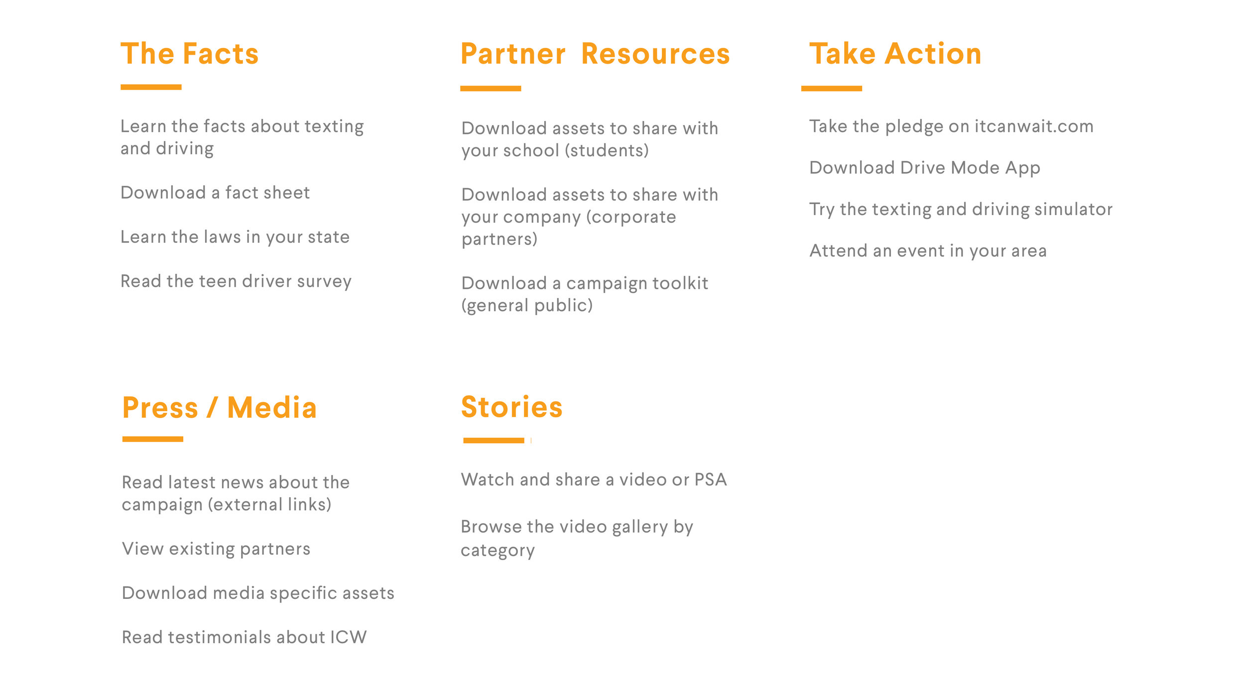
The first direction was to use intuitive, audience-driven categories as the basis for the main navigation. While certain informational content would be relevant across audiences, the navigation would have specific sections for corporate and educational partners, and press / media.


The second approach was to use an action-based navigation system as a way to walk users through an incremental journey. The proposed navigation suggests that participation begins with learning about the issue through facts, infographics and video content. Users can take action by signing pledges and trying simulators, and more committed users can become ICW ambassadors as students, media or corporate partners.


FINAL SITEMAP
Based on client feedback, we moved forward with a more audience-driven approach to content. The first step before making sketches or wireframes was to create a detailed information architecture, including site and content maps.

WIREFRAMES
I created two wireframe variations using the new site structure and proposed two distinct layout approaches. I also produced rough visual comps to illustrate to the client what the implementation might look like in higher fidelity.
Both versions have a carousel at the top of the page that can feature different kinds of rotating content. In Option 1, the primary persistent call-to-action for users is to take the ICW pledge. Below are three different “modules” with secondary actions, and a gallery of partners at the bottom of the page that foregrounds ICW as advocacy and partnership-building organization.


Option 2 takes a slightly different visual approach. It retains the carousel and pledge call-to-action, but uses social media and news modules to create a sense of activity and social sharing on the homepage.


Project Outcome
AT&T eventually moved forward with the proposed audience-driven approach to the information architecture and implemented the navigation on their site.