Store No8 Website
WEB, UX / UI, VISUAL DESIGN
Store No. 8
A website for the brand launch of Walmart’s new retail tech incubator

In early 2017, Walmart launched a new internal tech incubator called Store No. 8 to innovate around the future of retail.
Based in Silicon Valley and run independently from Walmart HQ, Store No. 8 was created as an R&D lab for experimenting with new technology and business models for retail. The name Store No. 8 comes from the name of Sam Walton’s early store, where he experimented with new and bold ideas for retail that would eventually become the Walmart empire. For their March launch, Store No. 8 needed a website to establish their brand out of the gate and recruit top tech talent to join the team. I was brought on by the brand team as the Lead Designer and Art Director to design the site for launch and bring the brand to life digitally for the first time.
Client
Store No. 8
Role
Designer & Art Director
DELIVERABLES
Wireframes, UI Design
TEAM
Gail Barlow, Brand Lead
Jeremy Anderson, Dev
YEAR
2017

BRAND BUILDING BLOCKS
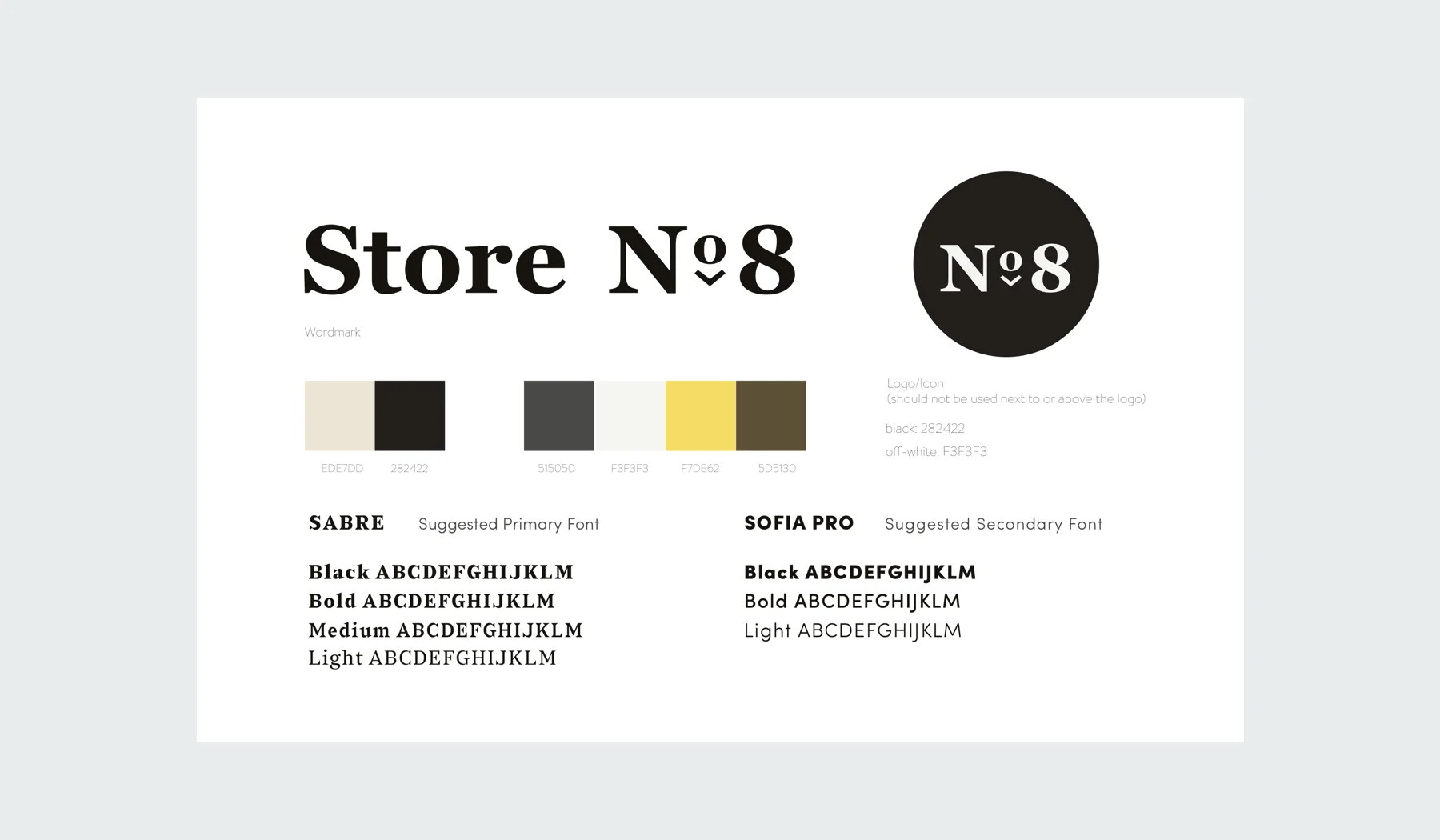
Store No. 8 wanted a site to communicate their mission statement, brand values, history and vision for their March 2017 launch. Building on the legacy of Walmart and the Walton family, their new brand identity was designed to reflect this past but also feel forward-looking. When I was brought onto the project, I was given some brand building blocks to work with: a robust and developed brand voice, a rudimentary visual identity and a vast archive of images from the Walmart Museum.


Wireframes
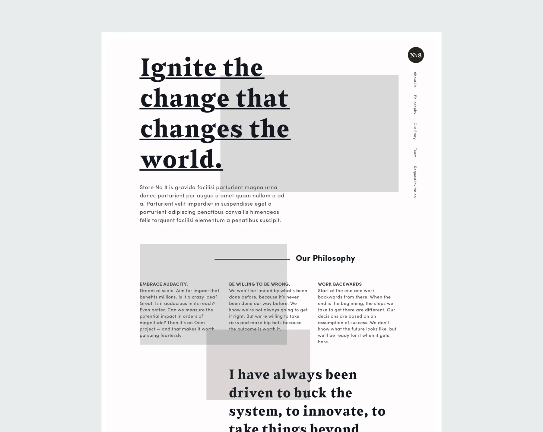
After some quick independent sketching, I moved directly into high-fidelity wireframing due to the accelerated timeline of the project. I decided that a one-page scrolling site would make most sense for launch and also allow for a flexible structure down the line.
In the wireframe phase, I experimented with how to organize and order the content to tell the brand story most effectively. I played with unconventional layouts, such as a fixed side navigation, and a more irregular grid system to evoke editorial layouts.

UI AND VISUAL DESIGN
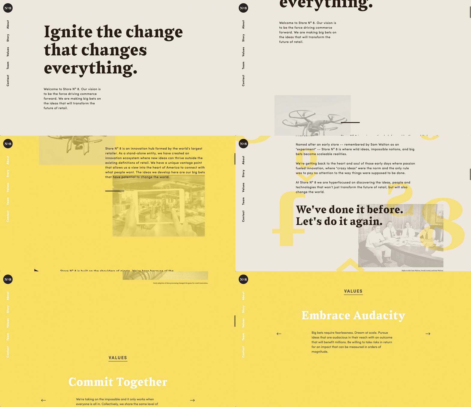
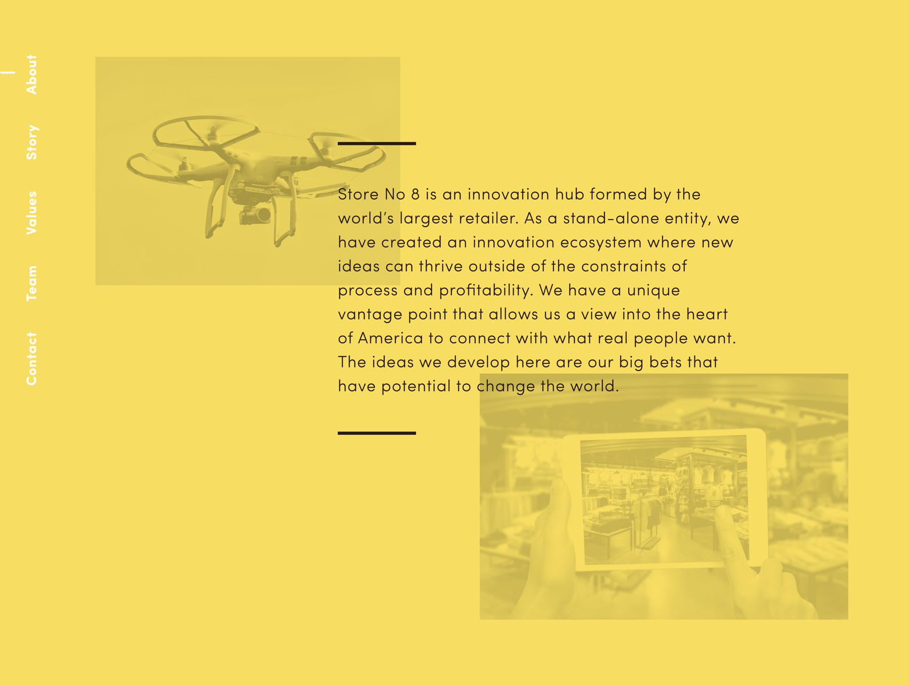
Using the existing brand assets of typography, color and imagery, I created a more digitally-friendly visual palette. I used large typography, layered type and images, and made a background pattern from parts of the logotype. The images were chosen to balance old and new, to reflect the Walmart legacy and also gesture to the future of tech innovation. Though the site was minimal in terms of interactivity, I came up with small details such as a faded color animation and side navigation system.


MOBILE SITE
The site was structure had to be adapted for mobile (rather than using a mobile-first approach) because of the unconventional layouts on the desktop version.
